-
Architects: MACLA Arquitectos
- Area: 929 m²
- Year: 2008
-
Photographs:Diego Opazo


The current offices of Taray SAU promoter, are placed in a triangular plot exempt. It is an isolated building which contained the offices of the promoter and we opted to maintain due to his perfect condition of conservation, attacking only the substitution of the exterior carpentry and the adequacy of the interiors appearance to the new face of the brand.

It is a building developed in a basement, foreseen for a future extension of the office, and one floor above ground that shelters the different departments of the promoter. The Basement is a lit by “english court” with acute geometry. The building trace responds to the geometry of the Plot potente and orientation criteria to optimize the termal behavior of constructed.

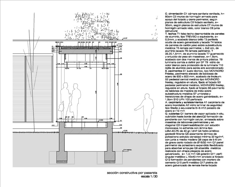
The extensión building is constructed as a “necklace” building around the existing building, so that both coexist without interfering in their scales. The old and new buildings are connected with glass walkways that provide high transparency between interior and exterior. The pieces of the necklace are the different parts of the program that are placed according to the needs of the inner workings of the company. We got to this strategy a courtyard, black gravel finish, visually linking the whole releasing important jobs outside traffic which favors an optimal environment to develop the work.

The development of the plot also has undergone surgery. In order to enhance the building proposes a neutral ground plane finished with white gravel or grass as areas and only have remained some large trees existing in the original plot. The mantle of white gravel contains about circles distinct aromatic ground cover and provide splashes of color, which gives to the whole the degree of abstraction and visual compositional intend with our project.

With all this, the building assumes the new face of the brand, a contemporary and cutting edge where visual criteria should go hand in hand to the constructive. The attention to detail is the maximum of Mies Van der Rohe constructive "less is more". The exterior walls are of concrete blind and polished galvanized steel joinery, in sharp contrast with the whitewashed walls and woodworks of the existing buildingA draft of etched glass wall and backlit, with the logo of the company, which bears the access road advertising space mode.


